


Daxton - The Covers
How it all came together

When I first set out to write this series I knew the covers was going to be the hardest part. I’d never really designed covers myself before and I could hardly afford to hire a professional. This was going to require a bit of ingenuity to make it work. As I always do, I pulled down some books off my shelf that resembled what I wanted my cover to look like.
As this would be the first book I knew it needed to set the tone as well as help me decide the look of every aspect of the book moving forward. I needed to future proof the thing. Whatever font size and style and arrangement of words that I used in this book would need to translate for the others. If you can believe it, my main concern at this point was the title. I had the title for the first 5 books but was drawing a blank on the 6th book title. In truth, I still have no clue what it would be called. But I tested the title for each book, supposing each book would be the same length so I could have a spine width to work with, then I set to work on Photoshop creating my covers:

Once I had each cover ready to go, the next step was going to be the main art. Again, this is a fiction series and by that definition, the way I saw it, I had two options for covers that would make it look like “fantasy” when you saw it:
Fancy letters.
Illustration of a character
Either option would cost a pretty penny. As simple as I’d like to think lettering is, it really isn’t and I’d already spent more hours than I care to admit trying to come up with the fonts I would be using for the interior of the book. And it turns out, lettering artists are just as expensive (if not moreso depending on the kind of design you want) than an illustrator.
So, I went to Fiverr in hopes of finding someone who could illustrate what I needed. I already found the perfect background and literally had everything done for the cover except someone to go dead center, in this case, my main character; Daxton.
I found two Fiverr people who were reasonably priced. I gave them both the same images and description for what I was looking for:


Actual description I sent (warning: it’s rough):
Daxton | I’d like an image of Daxton. He’s just turned 18 years old. He has long dirty blonde hair that he wears down around his face. Hazel/Green eyes. His face should be stern and serious. No smile. His clothing should be similar to the examples I provided. What’s most important about the image is that he’s holding a compass in his left hand, dangling from a chain. I will provide examples of this as well. He should have a sword hanging from his hip. He is also wearing a quiver with arrows in it. The arrows are specific as to the feathers on one end. They should be purple feathers. I can provide images of arrows if necessary, just let me know? The background I just want to look like he’s standing near a seaside, with a pirate ship way in the distance. The background can be a bit blurred out as I want the foreground of Daxton to be the focal point.
Now I had to sit back and wait for the two designs. I’d have to go back and check but I believe they were both going to be done within a week and I had maybe 1 revision if I didn’t like what I received in any way. The first one I got back was…not good. It was too on the nose of what I sent (see my collage of images above top right):
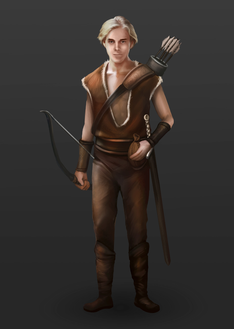
I chose not to have him so another revision. But, all was not lost! The other Fiverr guy sent me his illustration and I knew I had the guy I wanted! I’m going to show you the first illustration and then what it looked like after his revisions, side-by-side. Do your best to try and forget the image above ever existed. I know I do!
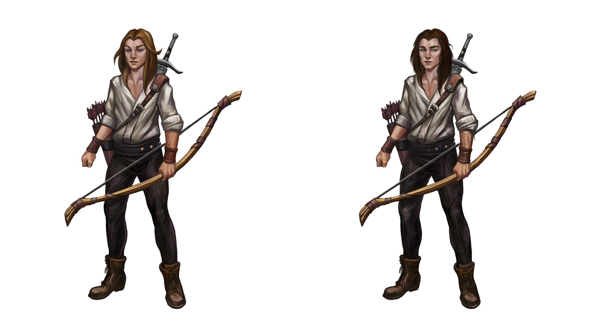
My revision notes that got him to go from the one on the left to lookiing like the one on the right:
The overall feel of the face is that it looks much too feminine. He should have more male facial features. I included some examples. Hope they are helpful. Thanks and I look forward to how much better this is going to be. The sword, bow, and arrows, as well as the boots and body shape, are amazing!
Once I had Daxton exactly how I pictured him in my head it was time to add him to the cover that I already pretty much had ready to go:
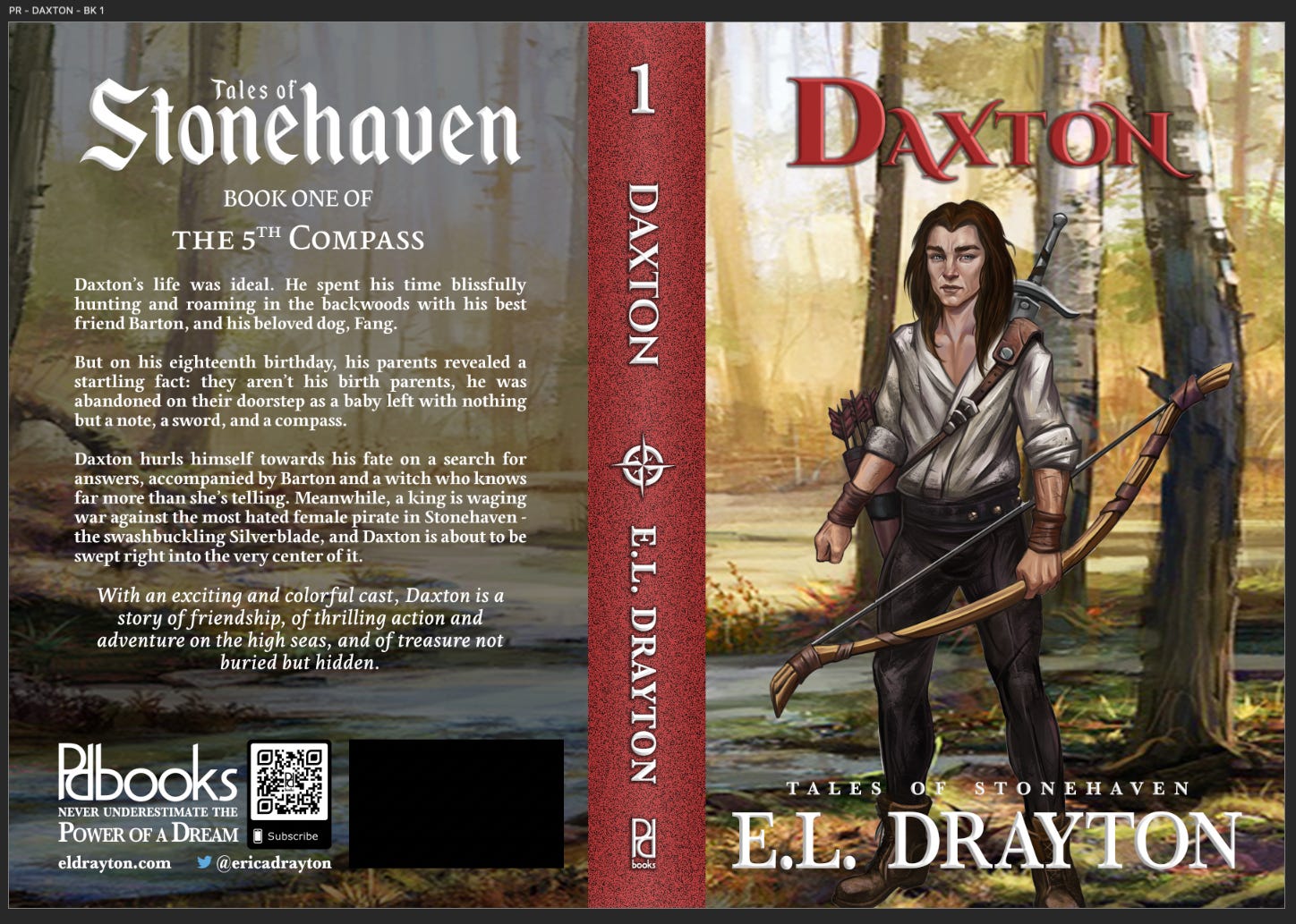
The spine width on this one was 100% accurate as the book was finished and edited fully by this time. Pretty chunky, right? Well, feast your eyes on the paperback! And shortly after, as a test, I created a larger format hardcover as well. I never made the hardcover available for purchase which is why it has “NOT FOR SALE” slapped on it. The quality was meh for me but I didn’t bother moving forward with trying another size or texture. And I’m honestly glad I didn’t because a rebranding is coming.


And speaking of rebranding. Next week, I’m going to share my decision about using E.L. Drayton and also my publishing imprint name “pd books” origin story! See you then!