Disclaimer: What you read here are my opinions. I am not an artist nor have I taken any courses/classes to make me an expert on cover design. My thoughts are based on my own personal first impressions. You do not have to agree with them and you should not let my opinion persuade you one way or the other. Whenever it is available I will credit the cover and letter artists with relevant links.
There are certain elements that all covers have and I think going over those elements and how they are represented for each cover would be a great place to begin (for now) with my teardown of a cover design.
Fonts (Title, Sub-Title, Author Name)
Art (Illustrated, etc.)
Colors
Layout
FONTS - 15/25
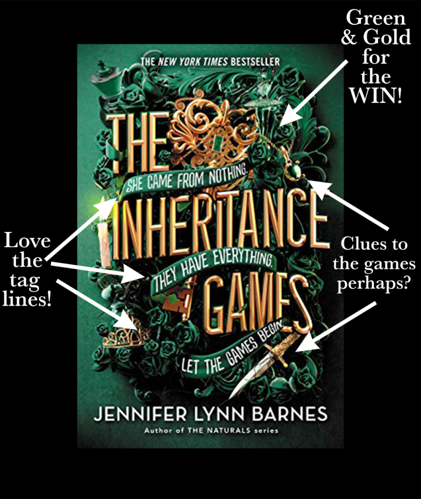
I think what I love most about the font choices here is more having to do with the way they don't necessarily line up or follow any pattern, if that makes any sense. How the main title is surrounded by the tag lines in a clever way and in a way they almost look like the blocky letters you'd see on a board game. Intentional? Perhaps. I especially like the use of the outline and shadow on the main title as I know there are some indie authors who create their own covers and might shy away from using those filters, as if they are a sign of being an amateur cover designer. If it can work here (used properly) it can work for anyone.
ART - 20/25
I love this new "in" thing for covers where it's all about the fancy letters and nuances around the title and there isn't an illustration of a character or location. I think it adds a touch of beauty and mystery, especially if those little details are an obvious part of the story and not just put there for the sake of decoration. In this case, I have not read the story (yet) but I have a feeling a lot of the tiny details of a chess piece, dagger, etc. will all be utilized (and possibly even important) to the story in some fashion. I also like the background color of green that is used. But more on color in the next section.
COLOR - 20/25
When I think of green I think of money and envy/greed. Someone is green with envy means they are jealous of the fortunes of another. Therefore, without even looking at the synopsis of this story I can surmise what it will be about just by picking up clues from the art and title. Then there is the use of gold. Another obvious choice when talking of a great fortune, of inheritance. Green and gold are such a great pairing. The markings of a great cover.
LAYOUT - 15/25
A bit jumbled together is the only way I can describe the cover. Of course, it looks slightly different when holding the book in your hand and looking at it up close. But I will say the shade of green for the background and the green used in the center image are so similar in shades that it can be difficult to tell them apart and see what the illustrator intended. I'm curious to know if they were trying to make the cover look like a wreath decoration that would be sent to the funeral of a person who's died? I can just about get behind that idea...but who knows... I just wish the image would've popped a bit more. Like a more vibrant green to tell it apart from the background.


